Challenge
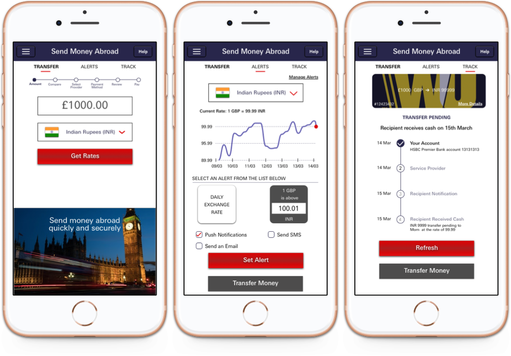
HSBC Bank wants to expand their banking capabilities for their remittance services. As one of the largest banks in the U.K., serving over half of Britain's households, HSBC wants to use their reach to improve the financial health of its customers. Their current mobile app & website are very well rated but they want to improve the experience of users when sending money to anyone abroad . They want us to add a new feature on their mobile app that would allow users to get the best experience with the best exchange rates.
Project
Objective
Add remittance services to the HSBC mobile app (inline with HSBC's design system).
Target users
Expats in UK who send money to their homelands.
Tools
Pen and paper, Sketch, InVision
Design process

Empathy
Market research
Competitive analysis
User interviews
Contextual enquiries

Define
Personas
Empathy maps
Problem statements

Ideate
Ideation
Sitemap
User flows
Wireframes

Prototype
Lo-fi prototypes
Hi-fi prototypes

Test
Usability testing
Affinity maps
Empathy
Market research and competitive analysis
We began by looking at the new trends and upcoming technologies in the banking sector. We looked at competitors websites especially the ones who are using new technologies and coming up with innovative ways of helping people manage their finances. This really helped us to know where the banking industry is heading to.
We also found out about the open banking which is the UK version on Payment Services Directive or PSD2. We wanted to make full use of this by introducing third party service providers into the HSBC apps.
User Interviews
Although our focus on the remittance services that people normally use (HSBC or 3rd Parties) but our aim was to understand the struggles that they go through in managing their finances in general. We then wanted to learn the users journey, interaction and the experience they have with their existing service providers. Our target audience were expats who regularly send money to their homelands.
Some key output of the research —
1. All participants managed their finances manually — pen and paper or spreadsheets.
2. They like budgeting and tracking there expenses
3. They all want to save money as much as they can.
4. They all would like to see notifications and alerts on their transactions.
5. Participants use third parties to send money to overseas because of better rates, transparency and fast service.
6. Integration of overseas remittance and budgeting in the bank app is desired.
7. Participants would like to know more about different schemes and offers (news and promotions)
8. They would like to save money for rainy days, children and family.
Define
We focused on Jack to create our persona out of this research. Jack is political researcher in London and regularly sends money to his family as he is the sole earner. He wished if the HSBC bank could give same remittance rates as his current third party it will save his time and energy.
Persona

After the persona development, we created an empathy map and a story board to understand Jack's motivations and experiences.
Empathy map

While synthesising the observations from our Empathy phase we now focussed on creating meaningful and actionable problem statements. These will eventually help us kick start the ideation process in the right direction.
Problem statements

Ideate
We began the ideate phase by Crazy 8 a core design sprint method — sketch 8 ideas in 8 minutes to generate a variety of solutions to our challenge.
We used the ideas from the sketching exercise to create a story. We merged few ideas to create a story for Jack to send the money to his Mom.
Now was the time to bring in all the information to create a sitemap that would be the foundation for how the user will experience the features of this product. The focus was only creating the sitemap for this additional remittance service.
We moved to creating a simple user flow that will help Jack to set an alert to be notified when the exchange rate goes above the set rate.
Sitemap

Using our sitemap and the persona we mapped out a simple user flow of the buying process. The flow shows how a user would use the navigation to select a category, apply filters and make a purchase.
Userflow

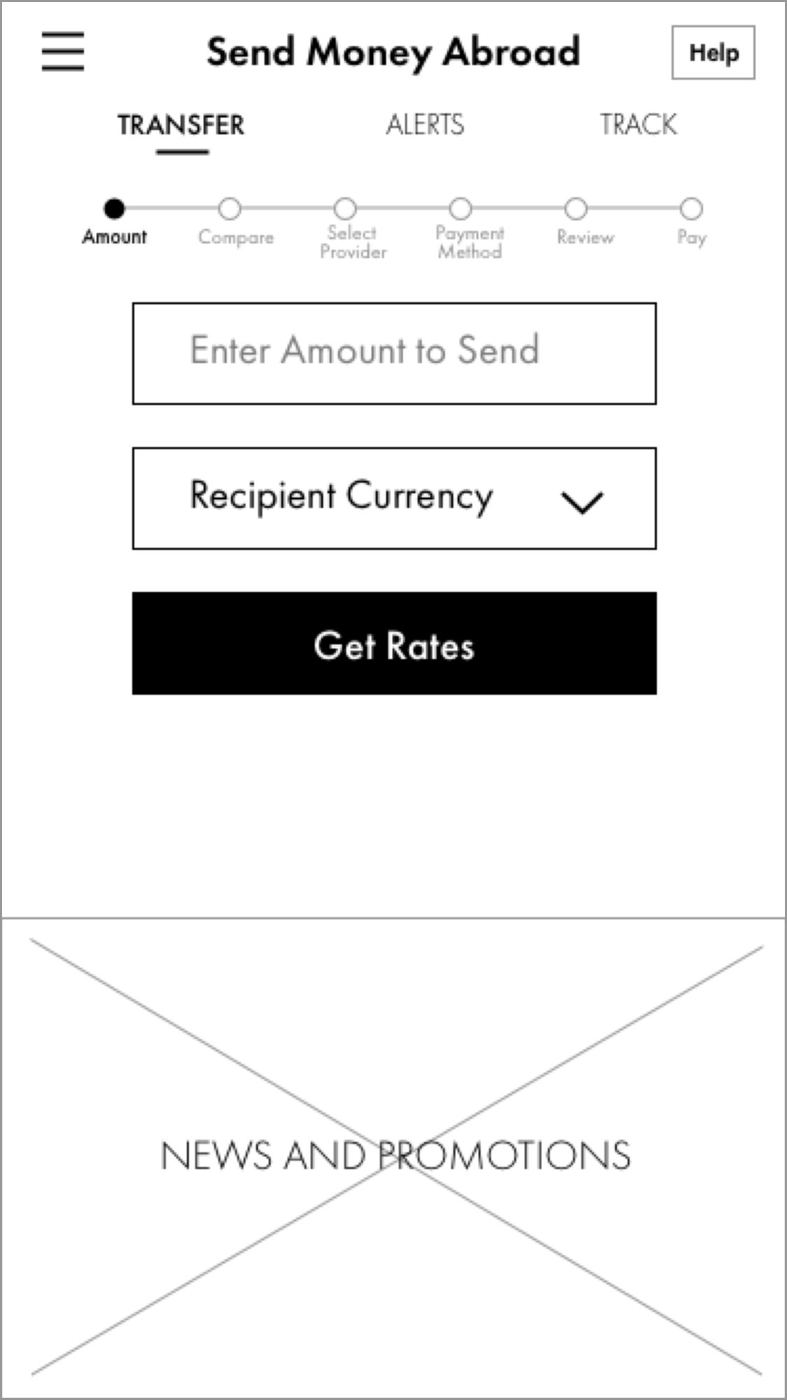
We then started to sketch layouts to generate a number of ideas. The goal was to see if users can figure out how to use the site to find an item and put them in the basket. We then moved to create lo-fi wireframes using the strongest of ideas. The wireframes helped in establishing visual hierarchy and creating a final layout of the elements. Then we made lo-fi responsive wireframes for desktop, tablet and mobile.
Reflection
This project has been a great learning experience overall. I really enjoyed interacting with users in during the research, card sorting and usability testing. It has really helped me understand how users think and behave when they interact with a product or a service. Looking back, I think I would engaged with more users which would have helped me in creating more personas.
Observing participants do the card sorting exercise was quite useful. It really paved the way for information architecture where I learned how to organize the raw data I had collected so far. Sketching wireframes, digitizing them, adding colours and interaction was both fun and exciting. I think I would have used a better colour palette and would have added more interactions. The real satisfaction was the positive feedback from usability testing of the Hi-Fi prototype.
Working closely with users has helped me design better; it is what I want to stick to in future designs.


